Self-initiated
Ethical AI
Reimagining support for unpaid carers with AI
I designed Withcare, an AI-powered mobile companion for unpaid carers in the UK. The project was a deliberate experiment: using AI at every stage of the design process to build a product powered by AI, for a population that has been systematically forgotten by the system meant to support them.

Role
Product Designer
Timeline
2 weeks
Team
1 Designer (Me)
Platform
Mobile App
Role
Product Designer
Team
1 Designer (Me)
Timeline
2 weeks
Platform
Mobile App
OVERVIEW
The problem
The problem
The problem
The UK's 5.8 million unpaid carers save the economy £162 billion a year. In return, many live in poverty, cut back on food and heating, and navigate a benefits system so complex and hostile that some never claim what they are entitled to.
The issue is that support is hidden, fragmented, and designed in a way that assumes carers already know what to ask for, where to ask, and how to persist. Most do not. And by the time they find out, they are already in crisis.
The UK's 5.8 million unpaid carers save the economy £162 billion a year. In return, many live in poverty, cut back on food and heating, and navigate a benefits system so complex and hostile that some never claim what they are entitled to.
The issue is that support is hidden, fragmented, and designed in a way that assumes carers already know what to ask for, where to ask, and how to persist. Most do not. And by the time they find out, they are already in crisis.
The solution
The solution
The solution
Withcare is not a task manager or a wellness app. It is an intelligent navigator that sits in front of a broken system and acts as the unified, human layer carers have been asking for but the government cannot provide.
Rather than waiting for carers to ask for help, Withcare proactively surfaces the right support at the right moment, before the user reaches breaking point and before they know they need to ask. The AI works invisibly in the background, remembering what matters, joining the dots, and speaking like a calm and trusted person rather than a system.
Withcare is not a task manager or a wellness app. It is an intelligent navigator that sits in front of a broken system and acts as the unified, human layer carers have been asking for but the government cannot provide.
Rather than waiting for carers to ask for help, Withcare proactively surfaces the right support at the right moment, before the user reaches breaking point and before they know they need to ask. The AI works invisibly in the background, remembering what matters, joining the dots, and speaking like a calm and trusted person rather than a system.
OUTCOMES
A unified navigator
A unified navigator
A unified navigator
One product sitting across coordination, financial guidance, and emotional support, the one stop shop the system cannot provide.
Trust as a feature
Trust as a feature
Trust as a feature
Transparent memory controls and proactive referral design, built for a user group that has been let down by systems before.
DISCOVERY
Reading between the statistics
Reading between the statistics
Reading between the statistics
I started by reading the Carers UK State of Caring 2024 report in full, using Perplexity to build an initial landscape synthesis before going deeper into the primary source. What emerged was a picture of people ground down by a system that fragments support, hides entitlements, and treats those who claim them with suspicion.
The quotes stayed with me as much as the numbers: carers skipping meals, sitting in six layers of clothing, abandoning benefit claims mid-form because they had run out of energy.
I started by reading the Carers UK State of Caring 2024 report in full, using Perplexity to build an initial landscape synthesis before going deeper into the primary source. What emerged was a picture of people ground down by a system that fragments support, hides entitlements, and treats those who claim them with suspicion.
The quotes stayed with me as much as the numbers: carers skipping meals, sitting in six layers of clothing, abandoning benefit claims mid-form because they had run out of energy.
A small shift
A small shift
A small shift
The original brief asked how we might design an app to help unpaid carers stay on top of their responsibilities, from coordinating care to managing their own wellbeing. The research did not contradict that. It went deeper. The real barrier is not that carers struggle to juggle everything. It is that they cannot access what they are entitled to, navigate the system that is supposed to support them, or ask for help before they have already hit a wall.
The original brief asked how we might design an app to help unpaid carers stay on top of their responsibilities, from coordinating care to managing their own wellbeing. The research did not contradict that. It went deeper. The real barrier is not that carers struggle to juggle everything. It is that they cannot access what they are entitled to, navigate the system that is supposed to support them, or ask for help before they have already hit a wall.
The missing piece
The missing piece
The missing piece
The existing carer app landscape splits into three categories: coordination tools, advice and support platforms, and NHS or local authority integration tools. Each does one job reasonably well, but none removes the cognitive burden of knowing which category your problem belongs in before you can get help. The white space was not an app that does everything, but one that starts with the person rather than the service structure.
The existing carer app landscape splits into three categories: coordination tools, advice and support platforms, and NHS or local authority integration tools. Each does one job reasonably well, but none removes the cognitive burden of knowing which category your problem belongs in before you can get help. The white space was not an app that does everything, but one that starts with the person rather than the service structure.
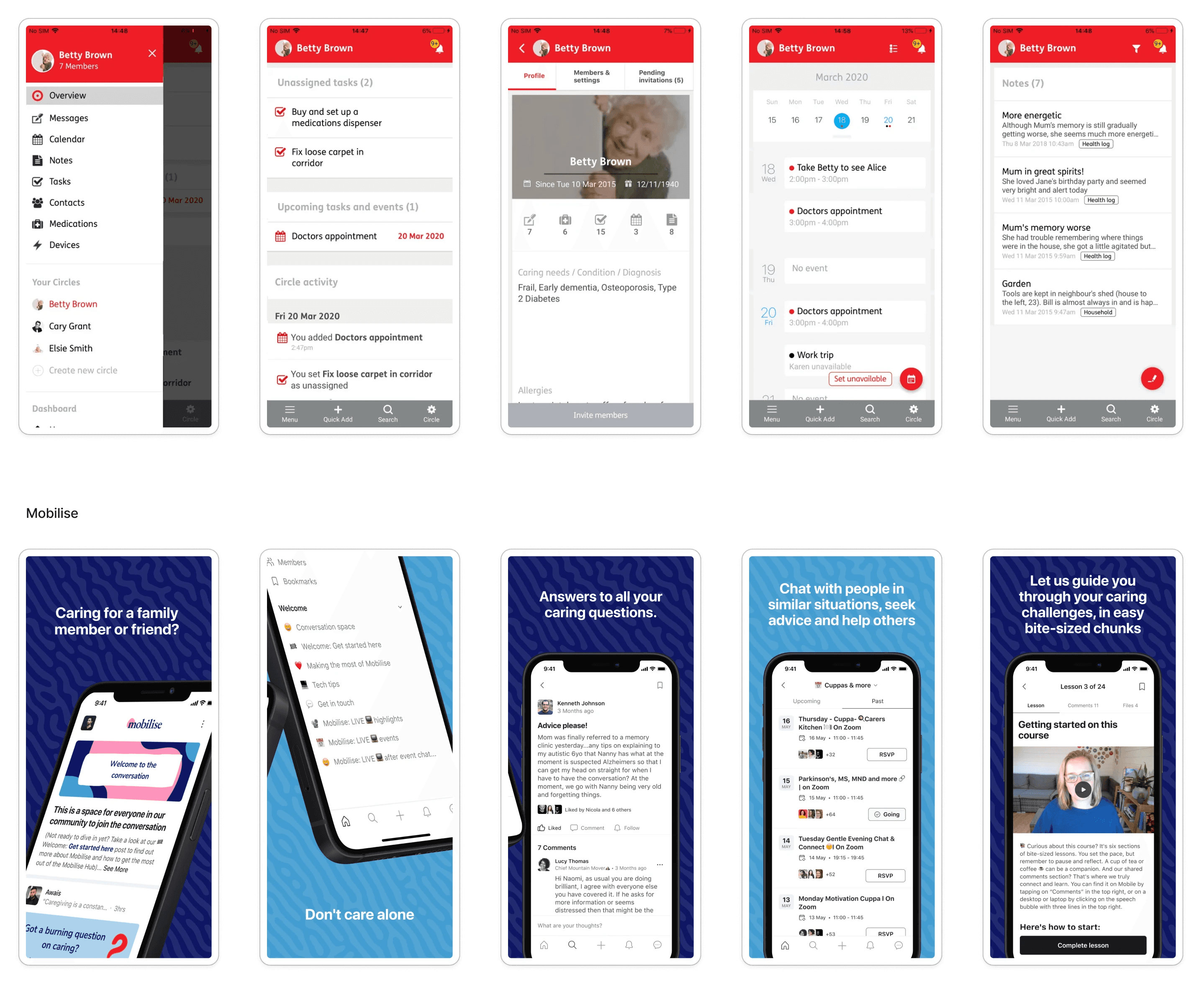
Some competitors
Who we're designing for
Who we're designing for
Who we're designing for
Before conducting the interviews, I built three synthetic personas grounded in the State of Caring research. I then used Claude to conduct in-depth interviews with each of them, exploring their relationship with technology, their mental models around AI, and what would make them trust or abandon a product like Withcare.
Before conducting the interviews, I built three synthetic personas grounded in the State of Caring research. I then used Claude to conduct in-depth interviews with each of them, exploring their relationship with technology, their mental models around AI, and what would make them trust or abandon a product like Withcare.

User personas
UX STRATEGY
Narrowing the field
Narrowing the field
Narrowing the field
With the research and personas in place, I ran a broad ideation session with Claude to surface everything this product could do.
I then mapped the full feature list against an impact and effort matrix, sorting ideas into quick wins, big bets, fill ins, and money pits. This is where I made the most deliberate business and engineering trade-offs.
With the research and personas in place, I ran a broad ideation session with Claude to surface everything this product could do.
I then mapped the full feature list against an impact and effort matrix, sorting ideas into quick wins, big bets, fill ins, and money pits. This is where I made the most deliberate business and engineering trade-offs.

Impact - effort matrix
Information architecture
Information architecture
Information architecture
The most important structural decision in Withcare was making the AI home screen the primary entry point for every session, rather than a feature among many. The AI operates on a model of contextual continuity without conversational history: each session opens fresh, but the AI is pre-loaded with everything it knows from previous interactions, so carers never have to repeat themselves or scroll back through difficult moments. Five tabs sit beneath the home screen for direct access, but the product is designed so that carers who do not know what they need never have to navigate to find help.
The most important structural decision in Withcare was making the AI home screen the primary entry point for every session, rather than a feature among many. The AI operates on a model of contextual continuity without conversational history: each session opens fresh, but the AI is pre-loaded with everything it knows from previous interactions, so carers never have to repeat themselves or scroll back through difficult moments. Five tabs sit beneath the home screen for direct access, but the product is designed so that carers who do not know what they need never have to navigate to find help.
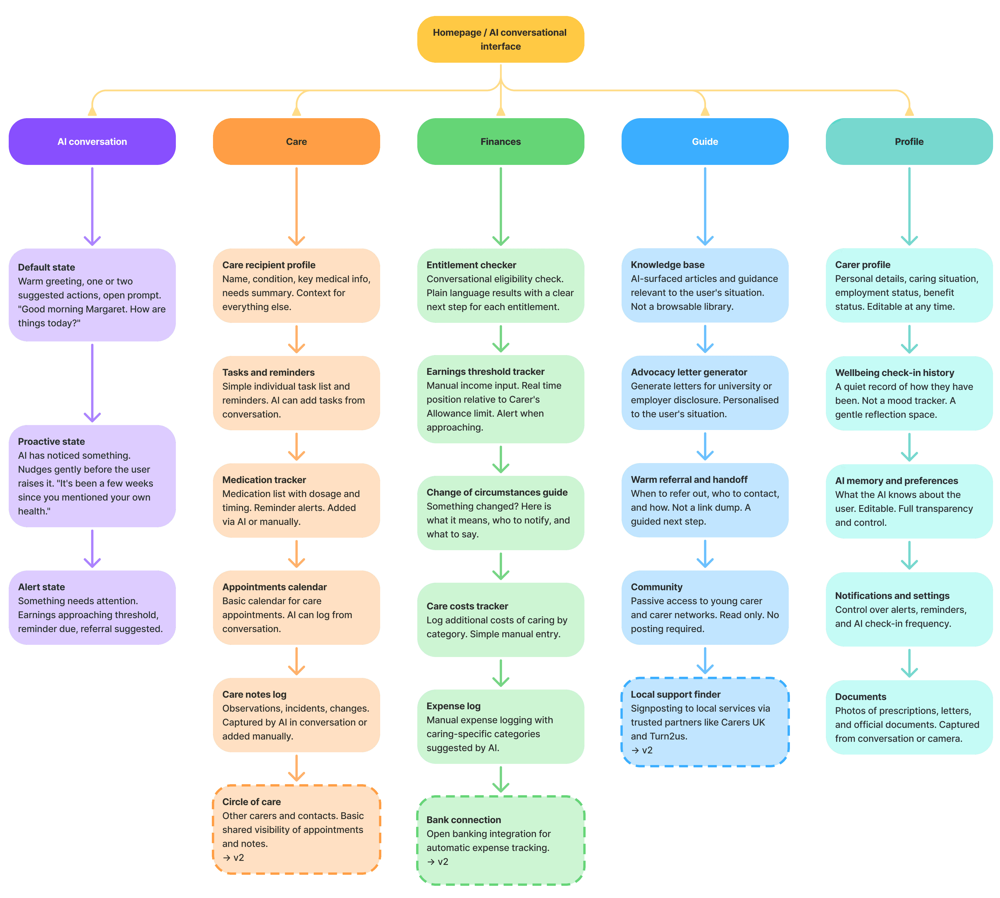
Information architecture
DESIGN
The user's path
The user's path
The user's path
Then I generated user stories for each core flows. From those stories detailed step by step user flows were mapped and used as prompts for Claude Design, generating wireframes screen by screen.
Then I generated user stories for each core flows. From those stories detailed step by step user flows were mapped and used as prompts for Claude Design, generating wireframes screen by screen.

Some of the wireframes generated with Claude Design
The visual direction
The visual direction
The visual direction
Before touching any screens, I built a moodboard to establish the emotional and visual direction of the product. I landed on a palette of teal, purple, and chartreuse: colours with warmth and personality that could feel calm and reassuring without being passive, and energised enough to motivate a user group that is often too exhausted to take action.
Before touching any screens, I built a moodboard to establish the emotional and visual direction of the product. I landed on a palette of teal, purple, and chartreuse: colours with warmth and personality that could feel calm and reassuring without being passive, and energised enough to motivate a user group that is often too exhausted to take action.

UI moodboard
Where it all comes together
Where it all comes together
Where it all comes together
With the visual direction established, I moved from mid-fidelity wireframes into high-fidelity screens in Figma, developing a full visual system along the way. The handwritten Withcare wordmark, an editorial serif for headings, and a set of soft organic shapes give the product a distinctive, human quality that sets it apart from the clinical or corporate register of most tools in this space.
With the visual direction established, I moved from mid-fidelity wireframes into high-fidelity screens in Figma, developing a full visual system along the way. The handwritten Withcare wordmark, an editorial serif for headings, and a set of soft organic shapes give the product a distinctive, human quality that sets it apart from the clinical or corporate register of most tools in this space.


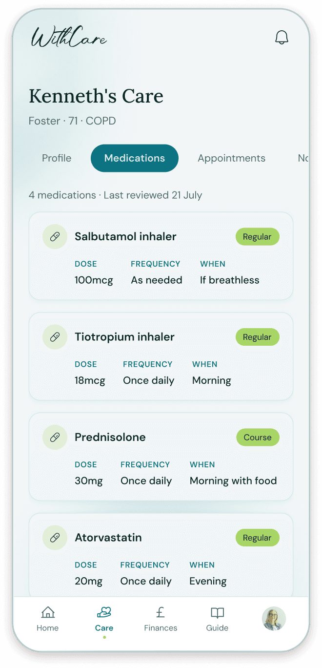


FINAL THOUGHTS
Working this way saved me a lot of time and mental energy, especially in the early stages where you are trying to make sense of a problem space before you have touched a single screen. AI handled a lot of the thinking work that usually slows things down, which meant I could move faster and stay focused on the design decisions that actually mattered.
That said, the final product is not as intuitive as I would like it to be. Speed has a cost, and in this case that cost showed up in the details. The synthetic user interviews were an interesting experiment, but in a real project I would always prioritise speaking to real people. They were were useful but also quite predictable. Real users surprise you, and those surprises are usually where the most important design insights come from.
The tool I will definitely use again is Perplexity. Without it I would never have found the State of Caring report, and that report completely changed the direction of this project. For any future work where I need to understand a user group quickly and thoroughly, Perplexity is now part of my standard process. I also enjoyed using Claude Design and Figma Make for generating mid-fidelity screens, though Figma Make produced better suggestions. And Claude was the most useful tool throughout, particularly for thinking through features, synthesising research, and stress-testing design decisions.
Working this way saved me a lot of time and mental energy, especially in the early stages where you are trying to make sense of a problem space before you have touched a single screen. AI handled a lot of the thinking work that usually slows things down, which meant I could move faster and stay focused on the design decisions that actually mattered.
That said, the final product is not as intuitive as I would like it to be. Speed has a cost, and in this case that cost showed up in the details. The synthetic user interviews were an interesting experiment, but in a real project I would always prioritise speaking to real people. They were were useful but also quite predictable. Real users surprise you, and those surprises are usually where the most important design insights come from.
The tool I will definitely use again is Perplexity. Without it I would never have found the State of Caring report, and that report completely changed the direction of this project. For any future work where I need to understand a user group quickly and thoroughly, Perplexity is now part of my standard process. I also enjoyed using Claude Design and Figma Make for generating mid-fidelity screens, though Figma Make produced better suggestions. And Claude was the most useful tool throughout, particularly for thinking through features, synthesising research, and stress-testing design decisions.


