DICE.fm

Events

How strategic design foundations set DICE's software migration in motion.

I led the foundational UX work for migrating DICE's legacy customer support platform into their B2B product MIO, consolidating two separate platforms into one and laying the groundwork for partner self-service at scale.

Role

Role

Product Designer

Product Designer

Timeline

Timeline

7 weeks

7 weeks

Team

Team

  • Designer (Me)

  • PM

  • Front-end Engineer

  • Back-end Engineer

  • UX Writer

  • QA Tester

  • Designer (Me)

  • PM

  • Front-end Engineer

  • Back-end Engineer

  • UX Writer

  • QA Tester

Platform

Platform

Responsive SaaS Web App

Responsive SaaS Web App

OVERVIEW

The problem

DICE.fm is a live events platform helping customers discover shows and giving organisers the tools to run them.

Its B2B platform, MIO, was becoming the central hub for all event operations. However, Customer Support teams still relied on a legacy platform, Pontare, for daily tasks: assigning tickets, refunding customers and merging accounts. Running two platforms in parallel created inefficiency, risk, and limited DICE's ability to scale toward self-service.

The problem

DICE.fm is a live events platform helping customers discover shows and giving organisers the tools to run them.

Its B2B platform, MIO, was becoming the central hub for all event operations. However, Customer Support teams still relied on a legacy platform, Pontare, for daily tasks: assigning tickets, refunding customers and merging accounts. Running two platforms in parallel created inefficiency, risk, and limited DICE's ability to scale toward self-service.

The solution

A cross-functional team was assembled to migrate Pontare's core functionalities into MIO, consolidating operations into one platform. The first phase focused on setting the design foundations for the migration, with partner self-service as a future opportunity to unlock once the groundwork was in place.

The solution

A cross-functional team was assembled to migrate Pontare's core functionalities into MIO, consolidating operations into one platform. The first phase focused on setting the design foundations for the migration, with partner self-service as a future opportunity to unlock once the groundwork was in place.

OUTCOMES

30%

30%

30%

Projected reduction in development costs.

Projected reduction in development costs.

15%

15%

15%

Closer to DICE's $1M self-service goal.

Closer to DICE's $1M self-service goal.

40+

40+

40+

Internal beta users successfully migrated to MIO ahead of a full rollout to DICE's 1,000+ B2B clients.

Internal beta users successfully migrated to MIO ahead of a full rollout to DICE's 1,000+ B2B clients.

Blueprint

Blueprint

Blueprint

Design standards adopted by other squads for their own Activity Log redesigns.

Design standards adopted by other squads for their own Activity Log redesigns.

Handoff

Handoff

Handoff

Full documentation enabling the next designer to continue with confidence.

Full documentation enabling the next designer to continue with confidence.

RESEARCH & DISCOVERY

Understanding users and their system

I explored how Customer Support teams operated across regions, observing agents using Pontare in real time and asking questions about their most frequent actions, how they identified duplicate accounts and why they needed to track customer orders.
This gave me a clear picture of who I was designing for, what they needed, and how the existing platform worked, which I documented into a user persona and a flowchart mapping all existing platform flows.

I explored how Customer Support teams operated across regions, observing agents using Pontare in real time and asking questions about their most frequent actions, how they identified duplicate accounts and why they needed to track customer orders.
This gave me a clear picture of who I was designing for, what they needed, and how the existing platform worked, which I documented into a user persona and a flowchart mapping all existing platform flows.

User persona

Close-up Pontare's flowchart

User persona

Close-up Pontare's flowchart

A feature that demanded attention

The interviews revealed how many crucial features Pontare contained, but one stood out: the Activity Log.

MIO already had its own version, but it was far less readable than Pontare's, and I was concerned we'd be forcing Customer Support to downgrade. Speaking with the engineer who built it confirmed my suspicion: no designer had ever been involved, and a redesign had never been prioritised.
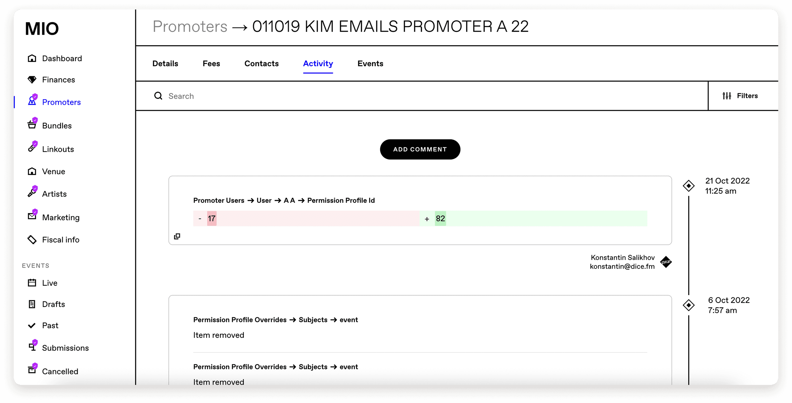
Legacy Activity Log in MIO

Competitor research: What good looks like

I analysed Pontare's Activity Log and then looked at how other enterprise platforms designed theirs to identify best practices worth replicating. Activity logs in well-designed platforms typically include a timestamp, the full name and profile image of the person who performed the action, an action-specific icon for quick visual scanning, categorisation of the activity type, and filter options for sorting and refining entries.

Competitor research: What good looks like

I analysed Pontare's Activity Log and then looked at how other enterprise platforms designed theirs to identify best practices worth replicating. Activity logs in well-designed platforms typically include a timestamp, the full name and profile image of the person who performed the action, an action-specific icon for quick visual scanning, categorisation of the activity type, and filter options for sorting and refining entries.

Some examples of Activity logs from my competitor research

UX STRATEGY

Defining the path forward

After presenting my findings to the cross-functional team, I proposed tackling the migration in six phases. I drafted a scope for each, we brainstormed together and agreed on a final list.

After presenting my findings to the cross-functional team, I proposed tackling the migration in six phases. I drafted a scope for each, we brainstormed together and agreed on a final list.

1- Foundational components and pages (part 1)

  • Customer dashboard + Search

  • Customer account header

  • Customer account activity log

  • Customer tickets log (past+ upcoming)

2- Foundational components and pages (part 2)

  • Event activity log

  • Customer ticket history

  • Refund

3- Ticket actions

  • Ticket transfer

  • Seating

  • Swaps

  • Assign ticket

  • Download ticket holder list

4- Login / Registration actions

  • Merge accounts

  • Update customer details

  • SMS

  • Notes

5- Waiting list

  • Increased visibility of customer Waiting List actions

  • Add / remove customer fro Waiting List

  • View all customers in the Waiting List for an event

6- Account actions

  • Block customer account

  • Delete skeleton accounts

  • Add notes to customer account

The strategy phase gave the full team a single source of truth, with the PM centralising all project information and Jira tickets in Notion. I then led the design of phase one, keeping partner self-service in mind throughout, specifically in how I organised the Fans section and the navigation patterns I chose.

EXPERIENCE DESIGN

Low-fidelity wireframes
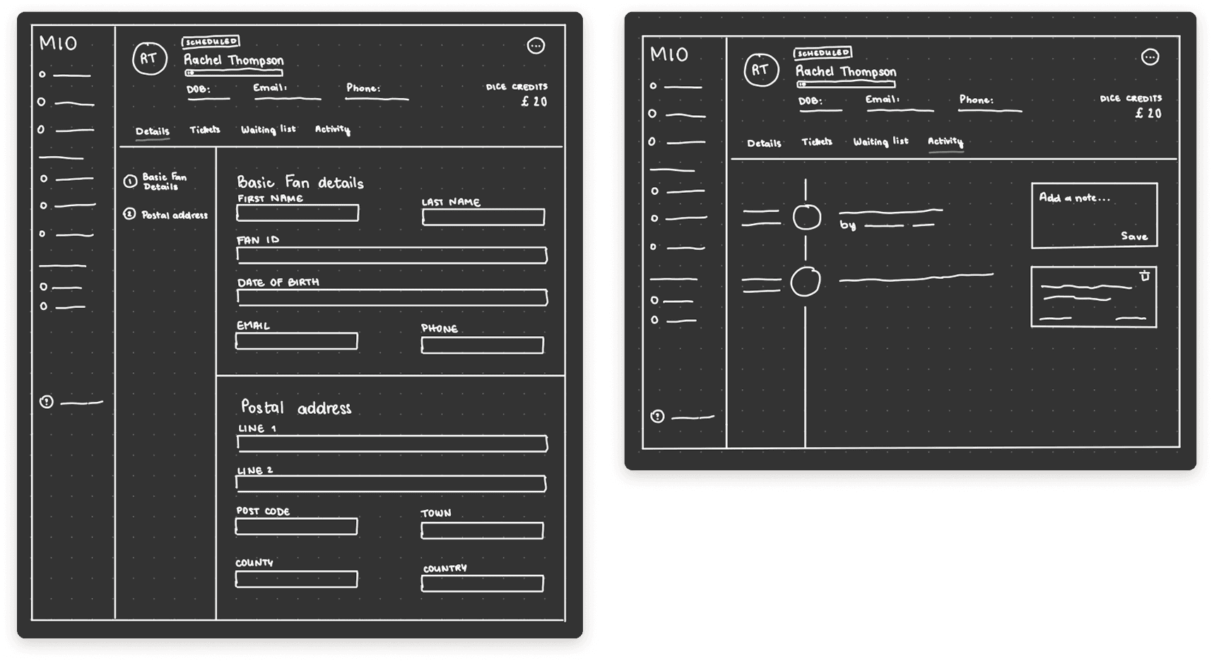
With the flow mapped, I moved to my iPad and sketched low-fidelity wireframes of the main screens. Working at this fidelity early allowed me to explore different layouts freely without getting attached to details too soon.

Drawing on research, I structured the Activity Log around five core elements: date, time, action performer, a concise description, icons for scanning, and notes for async communication. In Figma, I completed three mid-fidelity iterations, reusing existing components and gathering teammate feedback throughout, with the Activity Log requiring the most exploration to establish a scalable pattern across MIO.

With the flow mapped, I moved to my iPad and sketched low-fidelity wireframes of the main screens. Working at this fidelity early allowed me to explore different layouts freely without getting attached to details too soon.

Drawing on research, I structured the Activity Log around five core elements: date, time, action performer, a concise description, icons for scanning, and notes for async communication. In Figma, I completed three mid-fidelity iterations, reusing existing components and gathering teammate feedback throughout, with the Activity Log requiring the most exploration to establish a scalable pattern across MIO.

Usability testing

After refining with the UX Writer, I prototyped the designs and ran remote usability tests with 9 Customer Support agents. Users responded positively to the new Activity Log but were confused by the Notes section, so we revisited that feature. More critically, 5 out of 9 users couldn't find where to search for a customer, expecting a dedicated section in the navigation.

This led to a team decision to create a new Fans section in MIO, structured similarly to the existing Events section.

DELIVERY

A responsive, delivery-ready handover

Working with the UX Writer, I moved Customer Search into the new Fans section and delivered the MVP for the redesigned Activity Log with a cleaner, more skimmable UI.

Scope was refined by the PM to keep the first phase focused, and I adapted the designs for smaller screens using mobile components from the design system.

Phase 1 was presented at Sprint Review, approved, and I conducted Design QA throughout development to ensure the implementation matched the designs.

Final mobile screens

EY client using the plugin during a testing session