Self-initiated
Health
Modernising AthenaOne's design system for greater consistency and scale
I redesigned AthenaOne's user interface from the ground up, starting with deep research, design principles, building a full design system from tokens to documentation, and delivering modern, minimal dashboard and scheduling screens for healthcare professionals.

Role
Role
Product Designer
Product Designer
Timeline
Timeline
3 weeks
3 weeks
Team
Team
1 Designer (Me)
1 Designer (Me)
Platform
Platform
SaaS Web App
SaaS Web App
OVERVIEW
The problem
The problem
The problem
Athenahealth is a leading healthtech company providing cloud-based services that streamline administrative tasks, improve clinical workflows, and connect care providers with patients.
However, AthenaOne, their core platform, has a dated interface that lacks the consistency, clarity, and visual standards expected of modern SaaS products. For healthcare professionals who rely on it daily, this creates unnecessary friction in already high-pressure workflows.
The solution
The solution
The solution
I chose to solve the problem at its root by building a proper design foundation first. A new design system, grounded in clear principles and consistent tokens, would ensure that any screen redesigned on top of it would feel coherent, scalable, and intentional. I applied the system to the dashboard and scheduling screens first, where the friction was most visible and the impact of better design most immediate.

OUTCOMES
Scalable system
Scalable system
Scalable system
From tokens to documentation, built to support consistent product growth.
From tokens to documentation, built to support consistent product growth.
Modernised interface
Modernised interface
Modernised interface
Dashboard and scheduling screens redesigned to reduce friction for healthcare professional.
Dashboard and scheduling screens redesigned to reduce friction for healthcare professional.
DISCOVERY
Finding the starting point
Finding the starting point
Finding the starting point
I started by scouring the internet and YouTube to find as many real screens of AthenaOne as possible. The platform isn't publicly accessible, so gathering enough visual reference required digging through tutorials, demos, and user-shared screenshots to build a clear picture of the existing interface."
I started by scouring the internet and YouTube to find as many real screens of AthenaOne as possible. The platform isn't publicly accessible, so gathering enough visual reference required digging through tutorials, demos, and user-shared screenshots to build a clear picture of the existing interface."

Home page

Appointment scheduling page
Taking stock of what existed
Taking stock of what existed
Taking stock of what existed
Before building anything new, I audited the existing UI components across the screens I had gathered. This gave me a clear picture of the inconsistencies, redundancies, and patterns worth keeping, and formed the foundation for every decision made in the design system.
Before building anything new, I audited the existing UI components across the screens I had gathered. This gave me a clear picture of the inconsistencies, redundancies, and patterns worth keeping, and formed the foundation for every decision made in the design system.

Looking at the wider landscape
Looking at the wider landscape
Looking at the wider landscape
After researching online for user-reported challenges with EHR software, I wanted to dive deeper myself. I conducted a competitor research, exploring eight healthcare management solutions—here are a few:
Overall, I found that they all shared the same challenges as AthenaOne:
An outdated UI
Inconsistent styles and components
Poor information hierarchy
Overwhelming screens filled with data
After researching online for user-reported challenges with EHR software, I wanted to dive deeper myself. I conducted a competitor research, exploring eight healthcare management solutions—here are a few:
Overall, I found that they all shared the same challenges as AthenaOne:
An outdated UI
Inconsistent styles and components
Poor information hierarchy
Overwhelming screens filled with data

Preview of the competitor research
Inspiration beyond the industry
Inspiration beyond the industry
Inspiration beyond the industry
To avoid designing within the constraints of what already existed in healthtech, I looked beyond direct competitors for UI inspiration. I studied products known for getting clarity, hierarchy, and visual design right, drawing on examples from other complex SaaS environments to identify patterns and approaches worth bringing into AthenaOne's redesign.
To avoid designing within the constraints of what already existed in healthtech, I looked beyond direct competitors for UI inspiration. I studied products known for getting clarity, hierarchy, and visual design right, drawing on examples from other complex SaaS environments to identify patterns and approaches worth bringing into AthenaOne's redesign.

Collection of inspirations
UX STRATEGY
Design principles
Design principles
Design principles
I wrote three design principles, as they are crucial for a design system because they provide a guiding framework for the design teams.
I wrote three design principles, as they are crucial for a design system because they provide a guiding framework for the design teams.
QUALITY OVER QUANTITY
QUALITY OVER QUANTITY
QUALITY OVER QUANTITY
A design system built on reusability, consistency, and quality ensures that each component is crafted with care and used purposefully across products. By prioritizing excellence over volume, the system fosters a cohesive and reliable user experience while reducing redundancy and ensuring that every design decision is meaningful.
A design system built on reusability, consistency, and quality ensures that each component is crafted with care and used purposefully across products. By prioritizing excellence over volume, the system fosters a cohesive and reliable user experience while reducing redundancy and ensuring that every design decision is meaningful.
Clear Paths, Fast Results
Clear Paths, Fast Results
Clear Paths, Fast Results
A design system grounded in accessibility, clarity, efficiency, and performance ensures that every user, regardless of ability, can navigate with ease. By optimizing for speed and simplicity, the system delivers a seamless experience, allowing users to accomplish their tasks swiftly while maintaining a clear and intuitive interface.
A design system grounded in accessibility, clarity, efficiency, and performance ensures that every user, regardless of ability, can navigate with ease. By optimizing for speed and simplicity, the system delivers a seamless experience, allowing users to accomplish their tasks swiftly while maintaining a clear and intuitive interface.
Modular Thinking, Seamless Expansion
Modular Thinking, Seamless Expansion
Modular Thinking, Seamless Expansion
A design system that emphasizes scalability, modularity, flexibility, and governance empowers teams to evolve their products with confidence. By creating modular components that can adapt to various needs while adhering to structured governance, the system fosters innovation and consistency, enabling sustainable growth without compromising quality.
A design system that emphasizes scalability, modularity, flexibility, and governance empowers teams to evolve their products with confidence. By creating modular components that can adapt to various needs while adhering to structured governance, the system fosters innovation and consistency, enabling sustainable growth without compromising quality.
DESIGN
Brand as a starting point
Brand as a starting point
Brand as a starting point
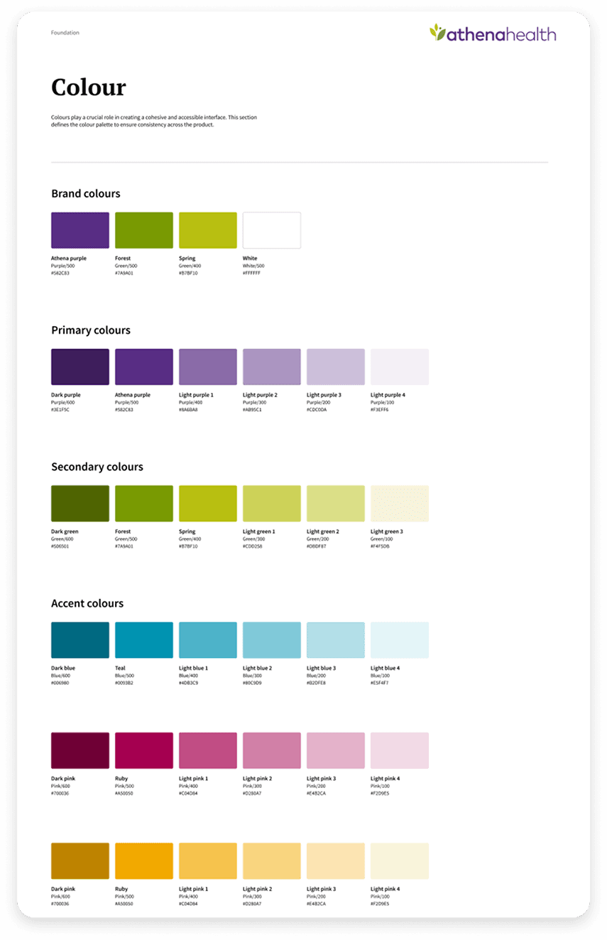
During my research I uncovered AthenaHealth's existing brand colour guide and typography. Rather than starting from scratch, I used these as a foundation, building an accessible colour palette and a structured font scale that felt native to the brand while meeting modern accessibility standards.
During my research I uncovered AthenaHealth's existing brand colour guide and typography. Rather than starting from scratch, I used these as a foundation, building an accessible colour palette and a structured font scale that felt native to the brand while meeting modern accessibility standards.

A token structure built for scale
A token structure built for scale
A token structure built for scale
Following that, I set up local variables to enable contributors to create and update components seamlessly and efficiently.
I organised them by collections.
brand
mapped
alias
responsive
I took this approach to accommodate AthenaHealth's vast ecosystem.
Following that, I set up local variables to enable contributors to create and update components seamlessly and efficiently.
I organised them by collections.
brand
mapped
alias
responsive
I took this approach to accommodate AthenaHealth's vast ecosystem.

Some local variables
From atoms to organisms
From atoms to organisms
From atoms to organisms
For the components, I started by designing essential elements (atoms and molecules). I took inspiration from Atomic Design but remained flexible, as the framework can sometimes be too rigid for real-world projects.
For the components, I started by designing essential elements (atoms and molecules). I took inspiration from Atomic Design but remained flexible, as the framework can sometimes be too rigid for real-world projects.

Then, I put together organisms, the heavier parts of the system.
Then, I put together organisms, the heavier parts of the system.

DELIVERY
The system, applied and documented
The system, applied and documented
The system, applied and documented
To validate how the components would come together in context, I applied the system to AthenaOne's home page, calendar, and scheduling screen.
To validate how the components would come together in context, I applied the system to AthenaOne's home page, calendar, and scheduling screen.


With the redesign in place, I documented the design system thoroughly, covering usage guidelines, component behaviour, and developer-friendly specifications.
In a real-world scenario, this documentation would serve as the single source of truth for designers and engineers building on top of the system.
With the redesign in place, I documented the design system thoroughly, covering usage guidelines, component behaviour, and developer-friendly specifications.
In a real-world scenario, this documentation would serve as the single source of truth for designers and engineers building on top of the system.


