Bboxx
Energy
How a redesigned information architecture made customer data discoverable.
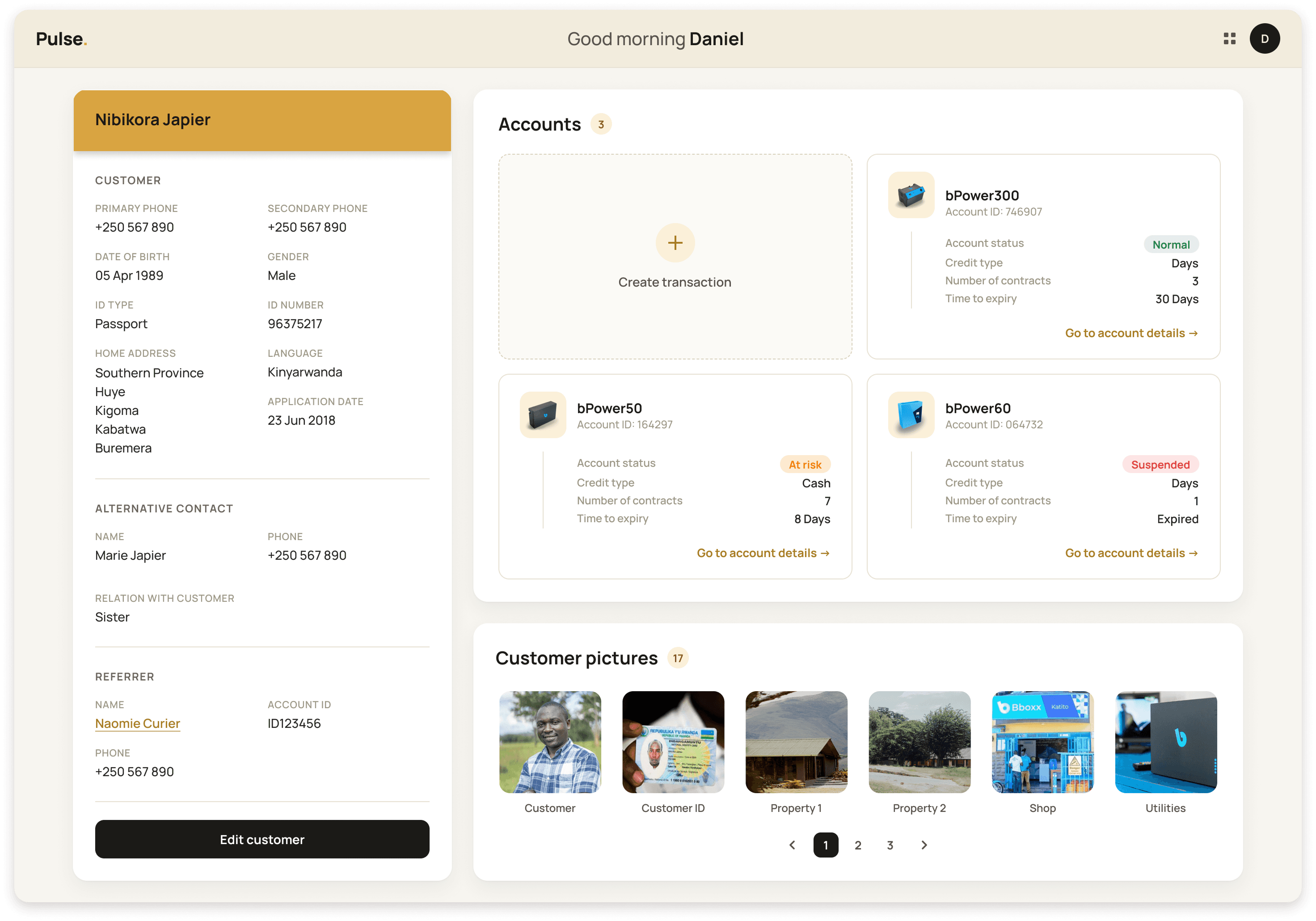
I overhauled the most visited page of Bboxx's internal platform Pulse, transforming fragmented customer data into a consolidated, clearly hierarchised view.

Role
Role
Product Designer
Product Designer
Timeline
Timeline
3 weeks
3 weeks
Team
Team
1 Designer (Me)
2 PMs
1 Front-end Engineer
1 Back-end Engineer
1 Designer (Me)
2 PMs
1 Front-end Engineer
1 Back-end Engineer
Platform
Platform
SaaS Web App
SaaS Web App
OVERVIEW
The problem
Bboxx delivers clean energy and pay-as-you-go solar to off-grid communities in sub-Saharan Africa. Their internal platform Pulse is used by staff across shop, call centre and HQ roles to manage customers and operations.
Despite being the most visited page, the Customer page was cluttered, missing key information, and fragmented, with every new purchase generating a separate page per customer and no consolidated view.
Bboxx delivers clean energy and pay-as-you-go solar to off-grid communities in sub-Saharan Africa. Their internal platform Pulse is used by staff across shop, call centre and HQ roles to manage customers and operations.
Despite being the most visited page, the Customer page was cluttered, missing key information, and fragmented, with every new purchase generating a separate page per customer and no consolidated view.
The solution
A full redesign of the Customer page as part of the Pulse 2.0 MVP, addressing both the information architecture and the overall experience. The goal was to create a single, scannable, consolidated view of each customer that gave staff everything they needed without switching platforms or hunting across multiple pages.
A full redesign of the Customer page as part of the Pulse 2.0 MVP, addressing both the information architecture and the overall experience. The goal was to create a single, scannable, consolidated view of each customer that gave staff everything they needed without switching platforms or hunting across multiple pages.

OUTCOMES
75%
Reduction in time spent searching for customer information in the 3 months after launch.
Reduction in time spent searching for customer information in the 3 months after launch.
3000+
Users across multiple African markets served by the redesign as part of the Pulse 2.0 MVP launch.
Users across multiple African markets served by the redesign as part of the Pulse 2.0 MVP launch.
One platform
Retail supervisors, sales agents, shop managers and technicians no longer need to switch between Pulse and ERP to do their work.
Retail supervisors, sales agents, shop managers and technicians no longer need to switch between Pulse and ERP to do their work.
DISCOVERY
Planning and running research
Following the kickoff, I arranged a walkthrough of the existing Customer page with a key stakeholder to understand how it was used in practice. I then formed a research trio with two PMs to plan and conduct user interviews, co-writing screeners and scripts in Confluence.
Moving fast, we split the work: I ran remote interviews with staff in Rwanda and Kenya, while the PMs conducted in-person sessions.
Following the kickoff, I arranged a walkthrough of the existing Customer page with a key stakeholder to understand how it was used in practice. I then formed a research trio with two PMs to plan and conduct user interviews, co-writing screeners and scripts in Confluence.
Moving fast, we split the work: I ran remote interviews with staff in Rwanda and Kenya, while the PMs conducted in-person sessions.
After the interviews, the three of us regrouped to consolidate notes and analyse findings, documenting everything in Confluence for full team visibility.
Three clear themes emerged:
The legacy Customer page was missing key information, forcing users to navigate between Pulse and a separate platform, ERP, just to do their work
Depending on screen size, the page could become very long, with little relevant information to justify the scroll
Users had specific data and functionalities they needed on the page that simply were not there.
After the interviews, the three of us regrouped to consolidate notes and analyse findings, documenting everything in Confluence for full team visibility.
Three clear themes emerged:
The legacy Customer page was missing key information, forcing users to navigate between Pulse and a separate platform, ERP, just to do their work
Depending on screen size, the page could become very long, with little relevant information to justify the scroll
Users had specific data and functionalities they needed on the page that simply were not there.

UX STRATEGY
Information architecture
Through conversations with stakeholders and users, three clear areas emerged:
the customer,
their account,
and their contracts.
These reflected the natural hierarchy of how Bboxx operates, where a customer can have multiple accounts, and each account can have multiple contracts. Making that structure visible and legible was the core strategic challenge.
I restructured the page into two pages rather than one. The extra click was a deliberate tradeoff. By giving each area its own space, users could immediately understand where they were and how everything related.
Through conversations with stakeholders and users, three clear areas emerged:
the customer,
their account,
and their contracts.
These reflected the natural hierarchy of how Bboxx operates, where a customer can have multiple accounts, and each account can have multiple contracts. Making that structure visible and legible was the core strategic challenge.
I restructured the page into two pages rather than one. The extra click was a deliberate tradeoff. By giving each area its own space, users could immediately understand where they were and how everything related.

EXPERIENCE DESIGN
From low to high fidelity
I began by sketching on paper, sharing early ideas in a team meeting to gather initial feedback before moving into Figma.
Mid-fidelity iterations followed, informed by that feedback and technical constraints, before a second design review shaped the high-fidelity version built for usability testing.
Regular presentations throughout kept the team aligned and helped define a focused, well-validated MVP.
I began by sketching on paper, sharing early ideas in a team meeting to gather initial feedback before moving into Figma.
Mid-fidelity iterations followed, informed by that feedback and technical constraints, before a second design review shaped the high-fidelity version built for usability testing.
Regular presentations throughout kept the team aligned and helped define a focused, well-validated MVP.

Usability testing
Users navigated easily between the Customer and Account pages, and between different accounts. The new structure made it quicker to access key information with noticeably less confusion, validating the core IA decision.
Users navigated easily between the Customer and Account pages, and between different accounts. The new structure made it quicker to access key information with noticeably less confusion, validating the core IA decision.

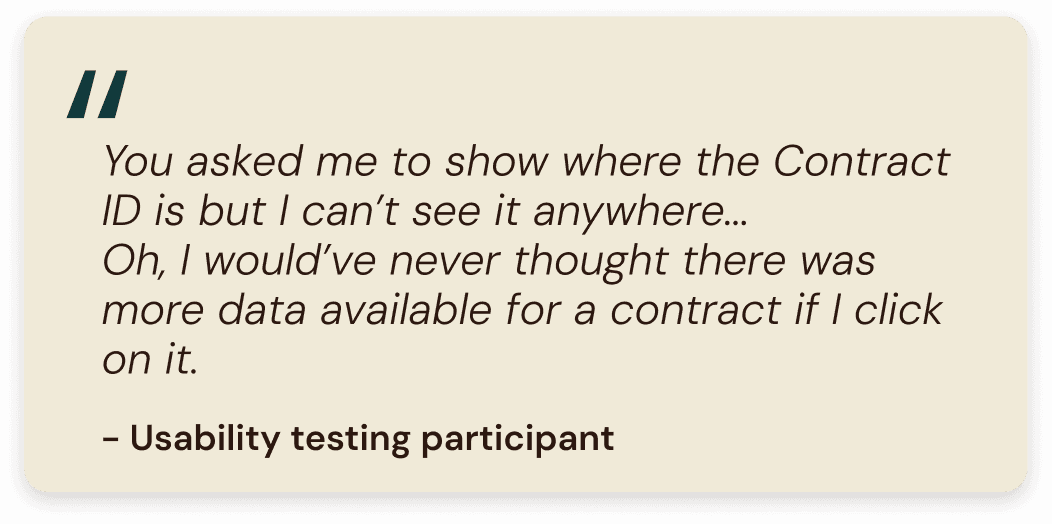
Some users struggled to find how to expand a contract to view its details. The interaction was not intuitive enough, pointing to the need for a clearer and more visible way to surface that information.
Some users struggled to find how to expand a contract to view its details. The interaction was not intuitive enough, pointing to the need for a clearer and more visible way to surface that information.
DELIVERY